
Branding is not just a logo
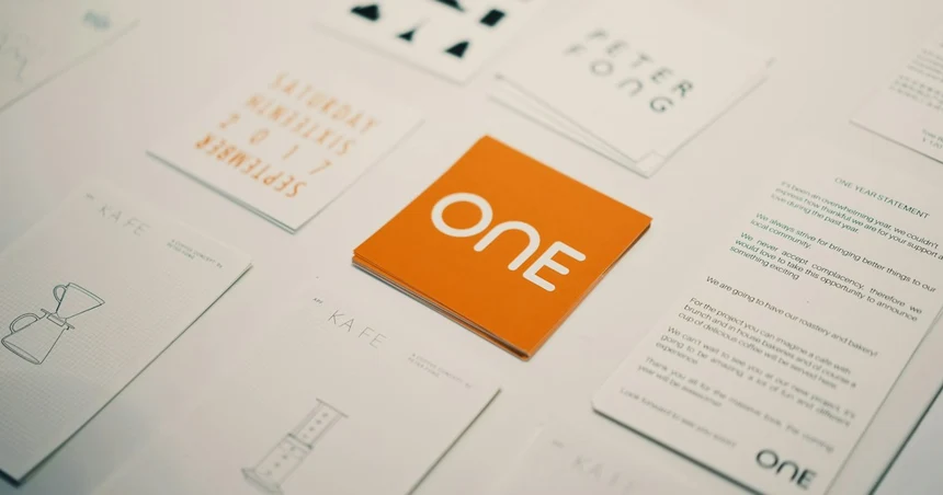
“We need a logo” is the most common brief we get, and about half the time it is the wrong one. Not because a logo does not matter: it does, but because the thing the founder is actually trying to fix usually lives one or two layers deeper, where a new mark cannot reach it.
This post is the map of those layers: what each one is, what it produces, and the symptom that tells you which one your problem is in.
The three layers, and what each one produces
Positioning: what you do, for whom, and what you will not claim. It produces sentences: the one on your homepage, the one a salesperson says on a call, the one a customer repeats to a colleague when you are not in the room. Nothing visual comes out of this layer, and everything downstream depends on it. A palette chosen before the positioning is a guess about a company that has not been described yet.
Voice: how those sentences sound. Three traits, a list of words you do not use, and the small rules that settle arguments: sentence case or title case, how you write dates and prices, what an error message says. It produces a way of writing that survives being handed to a new marketing hire.
The visual system: the mark, the colour roles, the type scale, spacing, motion, and the templates where all of it meets a customer. It produces reusable values, not pictures: a palette named by role, a type scale as numbers, components anyone can apply. The logo is one component of this layer, and the smallest one.
Only the third layer is visible, which is why the whole thing gets called “the logo”. It is like judging an outfit by the buttons.
Which layer is your problem in?
The symptom tells you, and the symptoms are distinct enough that you rarely need a diagnostic call to know.
| What you notice | The layer | What actually fixes it |
|---|---|---|
| Two people on the team describe the company differently | Positioning | A decision written down, not a design |
| The site says one thing, the deck another, the product a third | Positioning, then the system | Re-decide first, then re-apply |
| Every new page needs the founder’s eye before it ships | Voice and the system | Written rules and tokens |
| The mark breaks at 16 px, on dark, or in one colour | The mark itself | A redraw, not a rebrand |
| The brand looks fine and nothing converts | Probably not the brand | Look at the offer and the page |
That last row is the one worth dwelling on. A brand can be entirely healthy while the landing page is the problem, or the pricing is, or the product is. Branding work bought to fix a conversion problem is the most expensive way we know of to not fix it, which is why our own free 15-minute audit exists partly to say “this is not a brand problem” out loud.
So can you just get a logo?
Yes, in one situation: the positioning is already settled, one person makes all the material, and you need a mark that will not embarrass you in a deck. That combination is real and common at pre-seed, and a carefully set wordmark plus one colour and one typeface will carry a company further than most founders expect. The stage-by-stage guide has the budgets for exactly that case.
It stops working the moment a second person starts producing material. A logo answers none of the questions they will ask, which blue, which weight, which layout, what tone in a release note, so each of them answers on their own, and the brand becomes an average of everyone’s taste. That averaging is usually invisible for a year and obvious in a screenshot afterwards.
What a system actually buys you
Three things, and none of them is “looking nicer”:
- Decisions stop being re-made. Colour by role, type by scale, spacing on one grid, the arguments that used to happen per page happen once.
- New surfaces cost less. The fifth landing page, the conference banner, the app icon, the OG card: all compositions of the same values rather than new design projects.
- The product and the marketing site stay one company. This is the one founders feel most, and it is almost always a handoff problem rather than a taste problem, which is why we hand identities over as design tokens rather than as a PDF.
If you want to see the difference between a system and a folder of files, the SaaS brand kit lists the twelve deliverables a real one contains, and twelve annotated identities show the same tests applied to brands you already know.
Evolving, refreshing, rebranding: three different bills
These get used interchangeably and they are not the same work.
- A refresh touches the visual layer only: a redrawn mark, a corrected palette, a tightened type scale. The positioning and the name stay. This is the cheapest of the three and the one most companies actually need.
- An evolution keeps the equity, the name, usually the mark’s core idea, and rebuilds the system around a positioning that has moved. Most of the work is in the applications, not the logo.
- A rebrand re-decides the story, and sometimes the name with it. It is the only one of the three whose cost is dominated by migration rather than design: every surface the old brand lives on has to move, in order. Our fifty-surface checklist is that work written out, and six rebrands that worked shows how six companies handled the same problem, in their own words.
Before commissioning any of the three, the three signals are worth reading, two of them at once is the threshold, and one on its own is usually a smaller fix.
Where AI fits in this
Generators are good at the part of this list that is drawing and bad at the part that is deciding, which is most of it. What AI actually replaces in a branding project goes through both halves honestly, including the copyright gap founders tend to find late.
In the end
A logo is a compression of a decision. If the decision behind it is clear, the mark does a lot of work with very little material. If it is not, no amount of drawing will supply it, and the tell is the sentence founders say without noticing: ignore how it looks, we’re actually good. Nobody should have to ignore anything.
Where to go from here
If you are building the full picture for a software product, start with brand identity for SaaS, the founder’s guide to what the system has to include and what it costs. When you are ready to commission it, the SaaS branding agency page shows the five-week scope with published pricing. And if the logo is genuinely the only piece you need right now, the logo design process walks the five phases.
FAQ
What does branding include beyond the logo? Positioning: what you claim and for whom; voice: how it sounds in a release note and in an error message; the visual system: colour, type, layout, motion as reusable values; and the applications where all of it meets a customer. The logo is the smallest of those and the only one people can picture, which is why it gets mistaken for the whole.
Can we start with just a logo? Yes, when the positioning is already settled and you need something that will not embarrass you in a deck. It stops working the moment more than one person is producing material, because a logo answers none of the questions they will ask, which blue, which voice, which layout.
When is branding worth the money? When the cost of inconsistency has become visible: the site and the product look like two companies, sales rebuilds the deck every quarter, or the category has moved and the brand still describes the old one. Before that, positioning plus a carefully set wordmark carries a company a long way.
Not ready to talk? Get a free 15-minute audit or see real prices.